Description
I created a dashboard for Samba Commerce, a dummy e-commerce company in Brazil.
Samba Commerce Dashboard is a comprehensive dashboard that serves as a company-wide tool for tracking and analyzing the business performance of Samba Commerce, including customer RFM segmentation.
Project Details
| Type | Tools |
|---|---|
| RevoU Assignment | Tableau |
Business Background
You are a data analyst at one of the fast growing ecommerce in Brazil named Samba Commerce, which just launched in 2021. Samba Commerce offers more than 15k products, and more than 50 product categories to the customers all over Brazil. There are a number of internal and external variables that support our business growth. We want to utilize more data to support our growth in 2022.
Mr. Ronaldinho (CEO), requested Mr Neymar (head of data) to create a company wide dashboard. Mr Neymar trust you to create the dashboard.
“Olá, as per my explanation in our Analytics town hall our Company’s main OKR (Objectives and Key Results) this year is about transactions. So Mr. CEO requested a dashboard for company-wide to understand our business performance better. The bigger picture is there in our current dashboard, I need your help to capture more metrics and revamp our dashboard to be more comprehensive and insightful.”
Dashboard Objectives
Build a company-wide dashboard used for monitoring the business performance of Samba Commerce.
- Who
- The dashboard will be used by various stakeholders within the company, including executives, managers, and analysts.
- Why
- The dashboard provides them with the data they need to get insights about the company’s performance.
Data Preparation
- Connect to the data source, and import the datasets. I cannot provide the source link for the data due to privacy restrictions, but here is the data dictionary for the datasets:
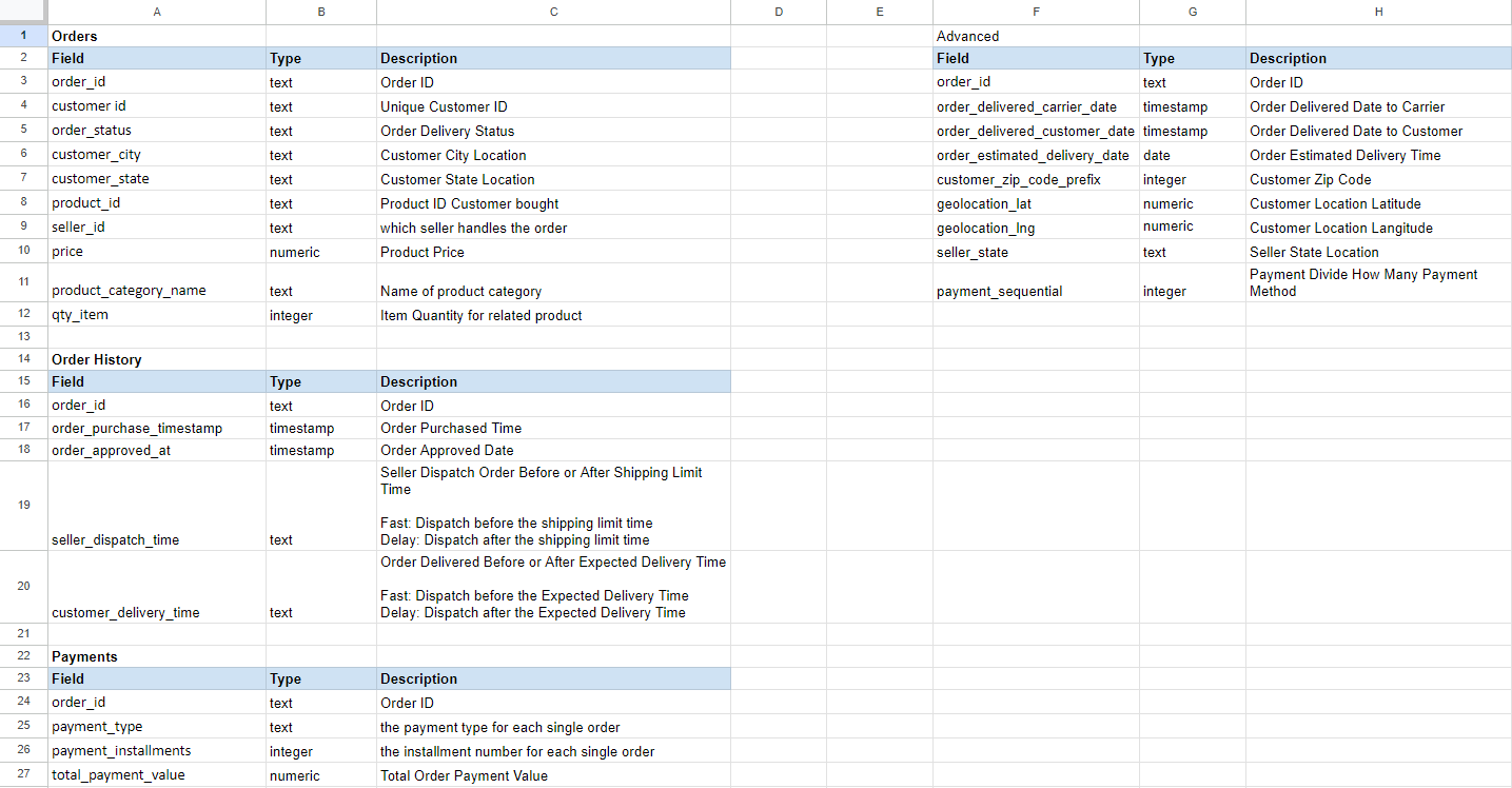
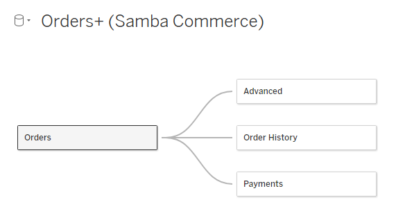
- Make relationship between each dataset so the values can be aggregated without merging the dataset.
Dashboard
There are 2 menus for this dashboard :
- Home
- Customer RFM Segmentation
Home
Home dashboard is opened by default, and can be accessed by clicking the Home icon in the navigation on the left side.
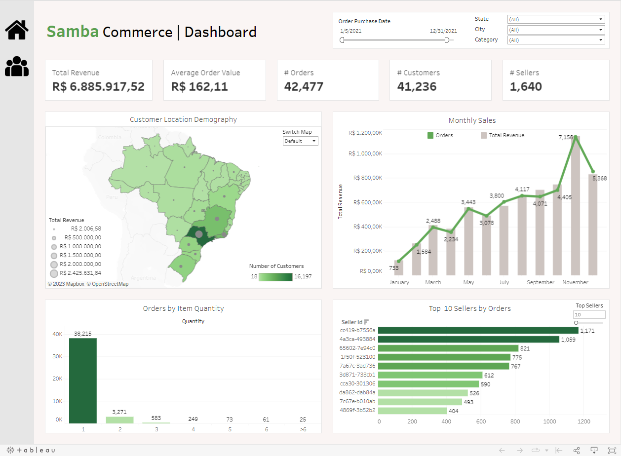
- Dashboard title, and filter controls.

- User can filter the data by order purchase date, customer state, customer city, and product category.
- Scorecards:

- Total Revenue by summing the Total Payment Value.
- Average Order Value (AOV) by averaging the Total Payment Value.
- Orders by counting the distinct Order Id.
- Customers by counting the distinct Customer Id.
- Sellers by counting the distinct Seller Id.
- Customer location demography using map chart.
- Map chart created by dual-axis method, showing data for each state.
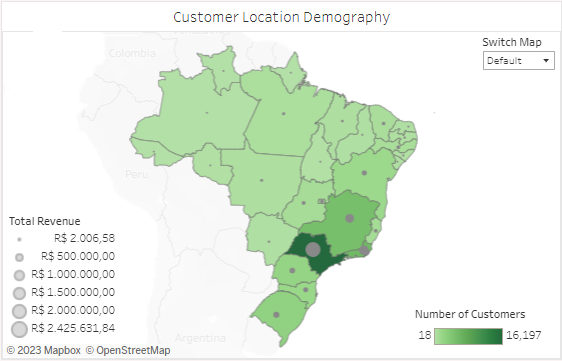
- The first is for showing number of customers visualized with filled-map. The darker the green, the more the customers. The details are shown in the tooltip.
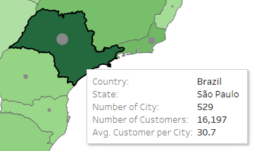
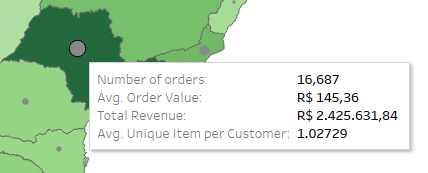
- The second is for showing total revenue visualized with circle. Bigger circle means bigger revenue. The details are shown in the tooltip.
- The first is for showing number of customers visualized with filled-map. The darker the green, the more the customers. The details are shown in the tooltip.
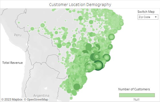
- Can also switch the map to show the data for each zip code by switching the map from Default to Zip Code in the menu on top-right of the chart.
- The details are shown in the tooltip.
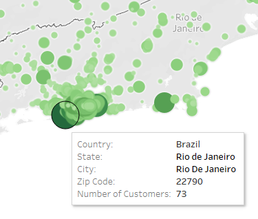
- The details are shown in the tooltip.
- Map chart created by dual-axis method, showing data for each state.
- Monthly sales using combo chart (dual-axis method).
- The chart is showing how many orders and how much revenue generated every month.
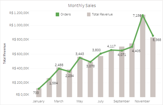
- The chart is showing how many orders and how much revenue generated every month.
- Orders by item quantity using bar chart.
- Since there are only a small number of transactions involving more than 6 items, they are grouped together.
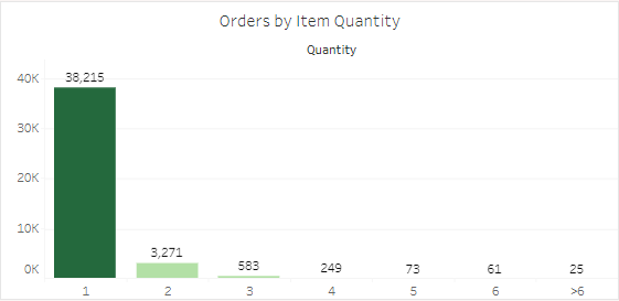
- Since there are only a small number of transactions involving more than 6 items, they are grouped together.
- Top N sellers by orders using bar chart.
- User can customize the result by changing the Top Sellers value in the top-right of the chart. The range for the value is 10 to 50.
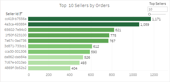
- User can customize the result by changing the Top Sellers value in the top-right of the chart. The range for the value is 10 to 50.
Customer RFM Segmentation
The dashboard can be accessed by clicking the Group icon in the navigation on the left side.
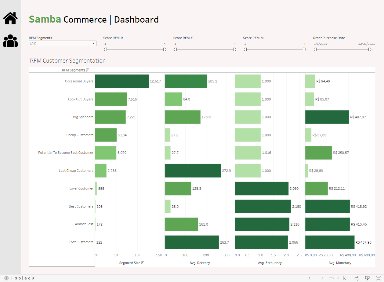
- Dashboard title, and filter controls.
- User can filter the data by the segmentation, recency score, frequency score, monetary score, and order purchase date.
- The highest score is 1 and the lowest score is 4.
- RFM Customer Segmentation
- A total of 10 segments created from the customers RFM score.
- The charts visualized the segment size, average recency, average frequency, and averagy monetary for every segment.
Slide Deck Example
Thank you for taking the time to visit my portfolio website and view my projects!
I appreciate your interest and support. If you have any feedback or questions, please don’t hesitate to reach out to me. Once again, thank you for your time and consideration.
» Let’s connect on LinkedIn! «
» Visit my Tableau Public profile to see my other dashboards «
